Hyundai Card
Staying ahead of Seoul
Hyundai Card came to us for a design ethos, one to set the direction for a new era of design in Seoul. An unusual request from a financial company. But not from this one.
In 2003, Hyundai Card commissioned its own typeface, years before Korean companies thought this was something worth owning. In 2007, it started flying global artists into a country the touring industry treated as optional, and kept doing so until artists started arriving unasked. It built a design library inside a hanok preservation district and a music library around a complete run of Rolling Stone. Its Vice Chairman and CEO, Ted Chung, has personally shaped the design of 29 of its spaces.
This wasn’t just a marketing play. It was a company testing its own limits.
Everything Hyundai Card made was excellent on its own terms. But the variety was both an achievement and obstacle: no single impression of the business came through.
Seoul, underneath
A Korean business can’t be understood from a desk in London. So we didn’t try. We spent time in Hyundai Card’s offices and with their customers, interviewed young Koreans about their futures, and toured the city with a local historian who showed us the Seoul behind the one visitors see.
Seoul projects ease. But what we found was a generation under more pressure than its own image lets on. More than eight in ten South Koreans in their twenties still live with their parents, the highest share in the OECD. The cost of living is high enough that people are deciding not to have children. The milestones that used to signal you’d made it, a home, a marriage, a family, are moving out of reach.
So young Koreans define themselves in other ways. Through taste, and through what they choose.
We’d expected people to talk about brands in tiers, cheap to luxury. Nobody did. Brands are finer signals of access and identity, legible to anyone who knows how to read them. Which makes what you carry consequential. A card says something about who you are and who you intend to become.
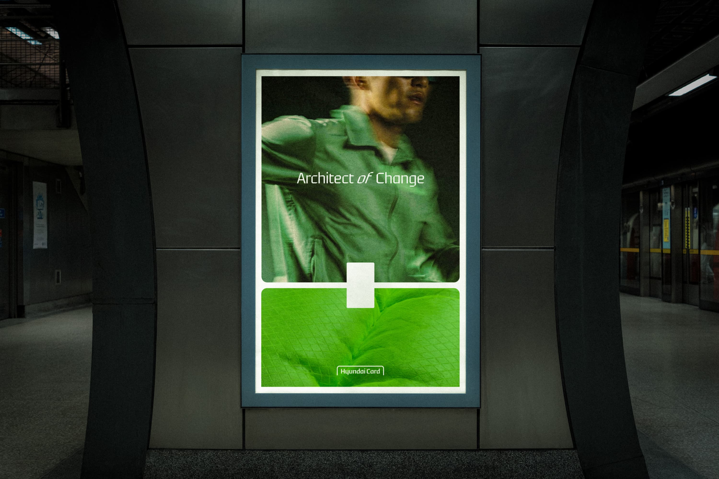
Architect of Change
Most brands give you access to what already exists. Hyundai Card had spent two decades adding to it, without ever naming what it was doing. A design library in a hanok. A stadium show in a city tours used to skip. Each one gave people something new to choose, and more room to decide who they are.
That became the idea: Architect of Change. Architect, because the company builds new possibilities for people to choose from. Change, because each one widens what people believe is open to them. The choice stays with them.
Fixed, then free
Every new card used to be designed from scratch at considerable expense. Two decades of that produced a lot of design and not much cohesion.
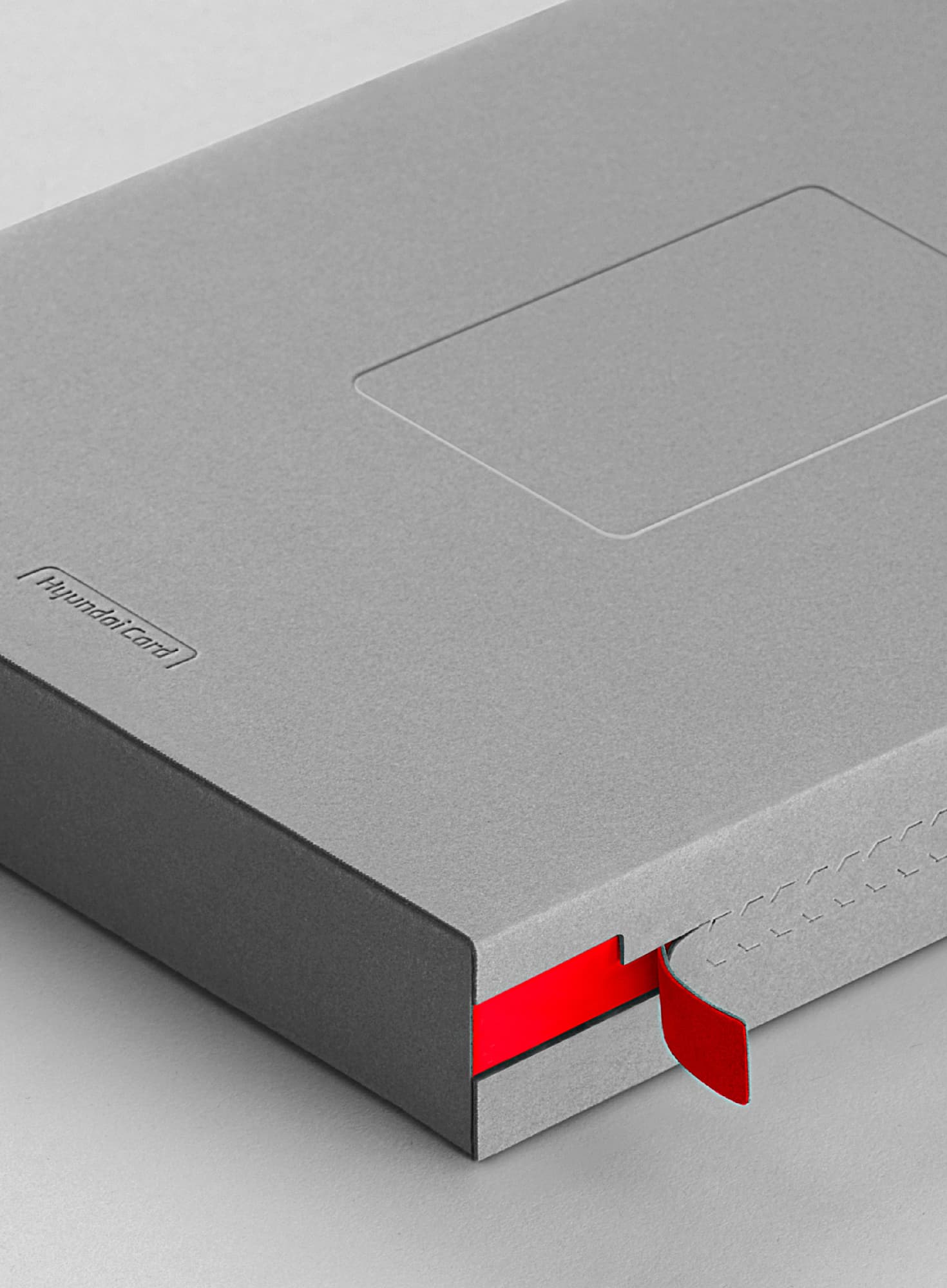
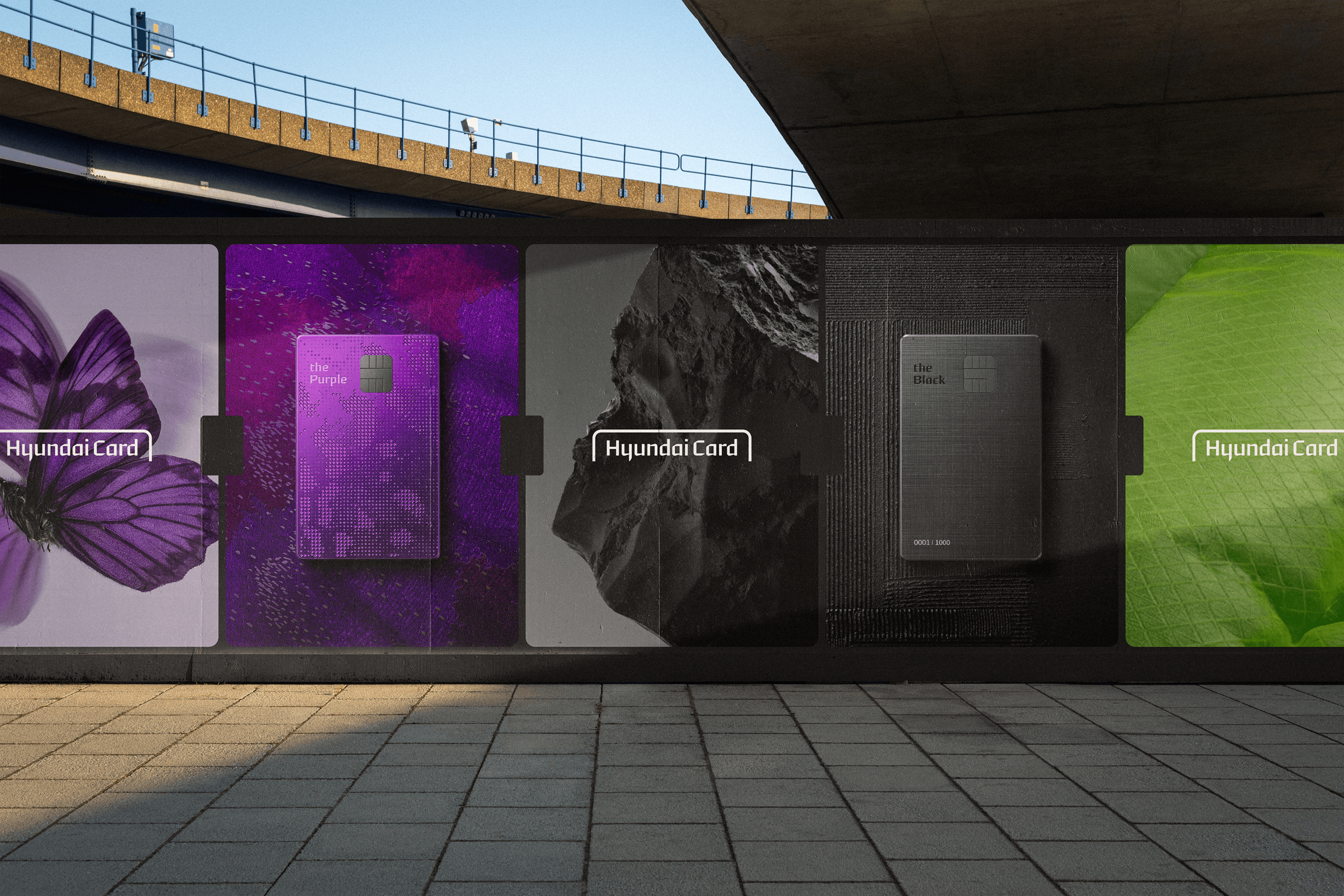
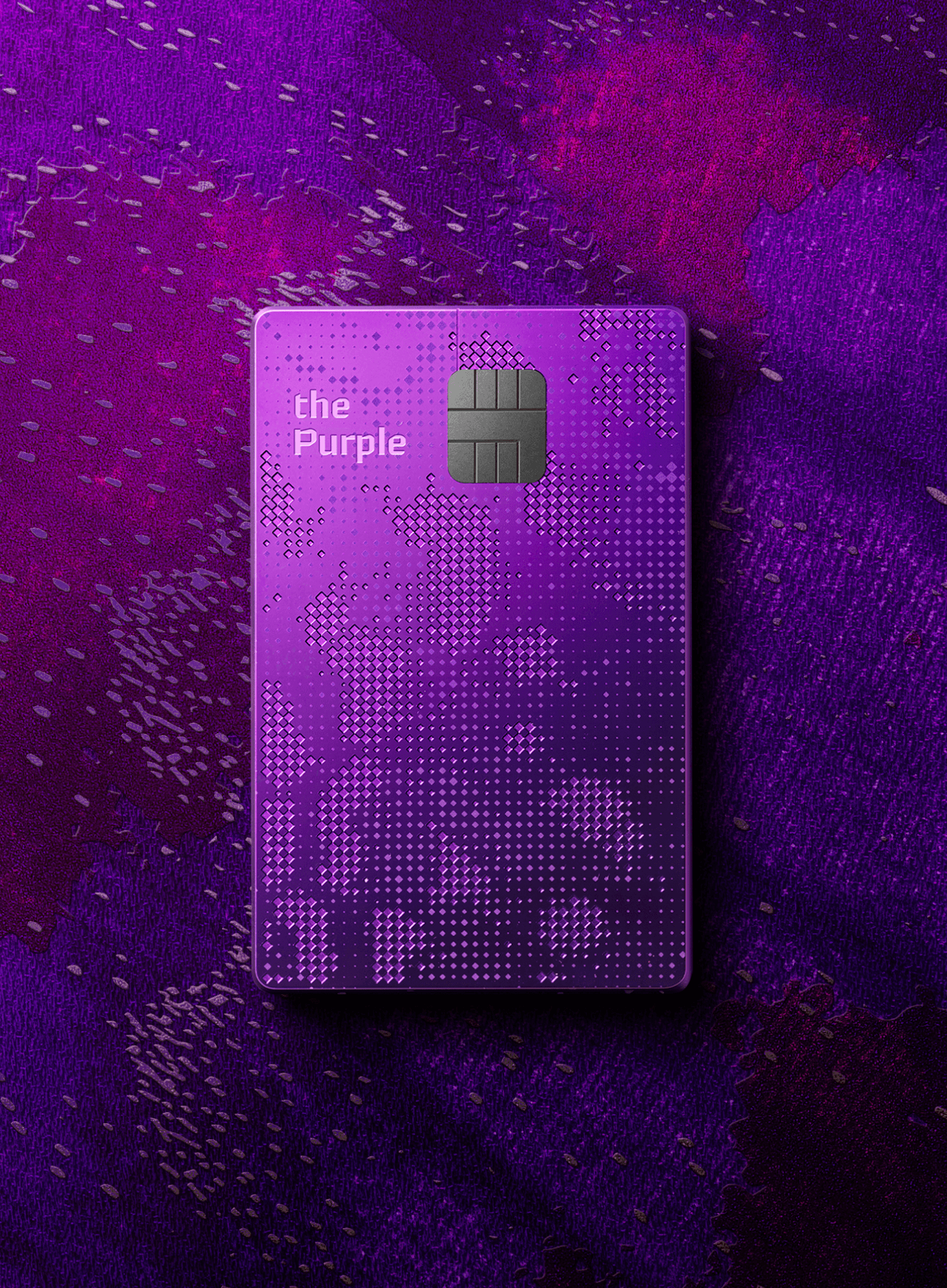
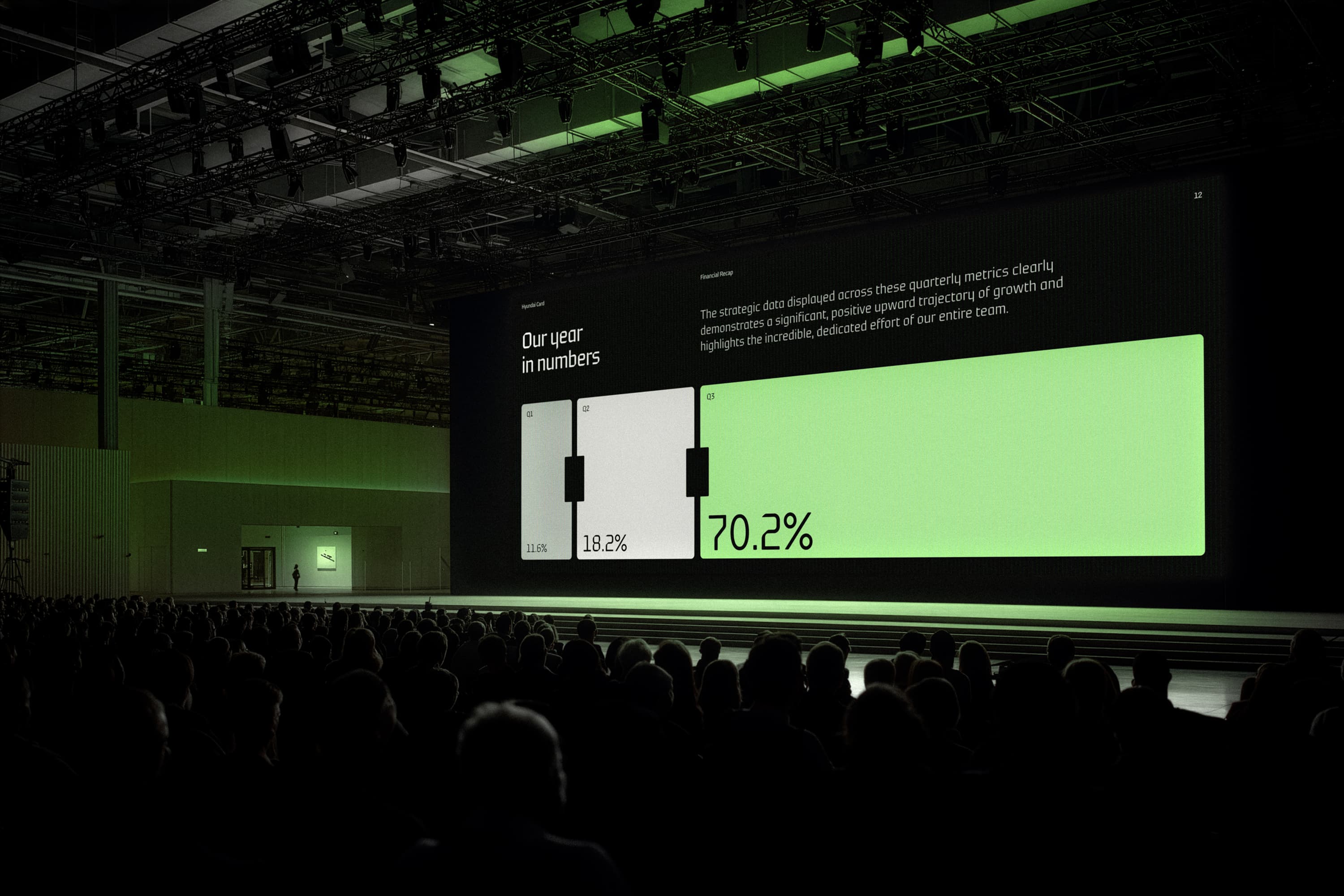
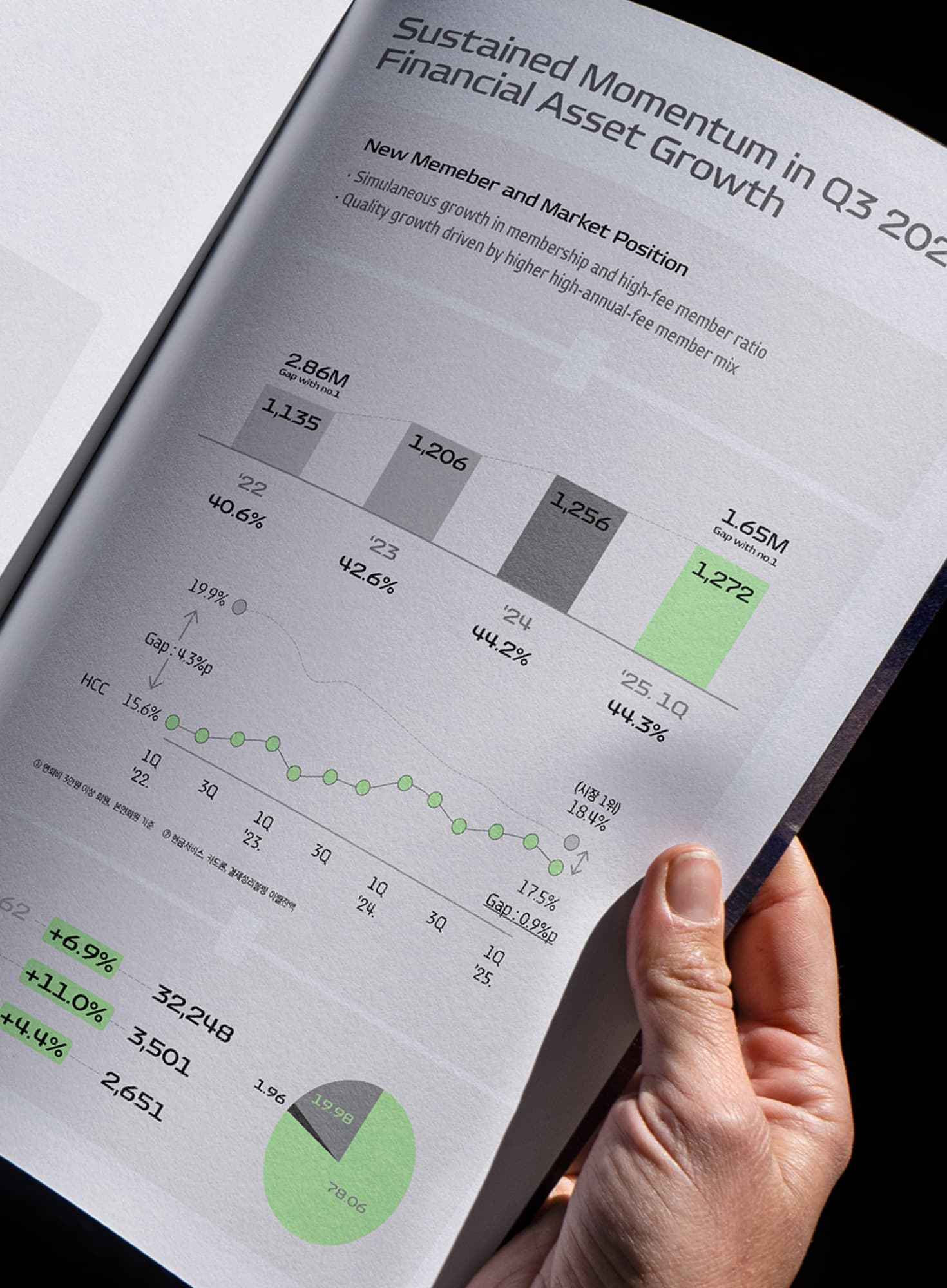
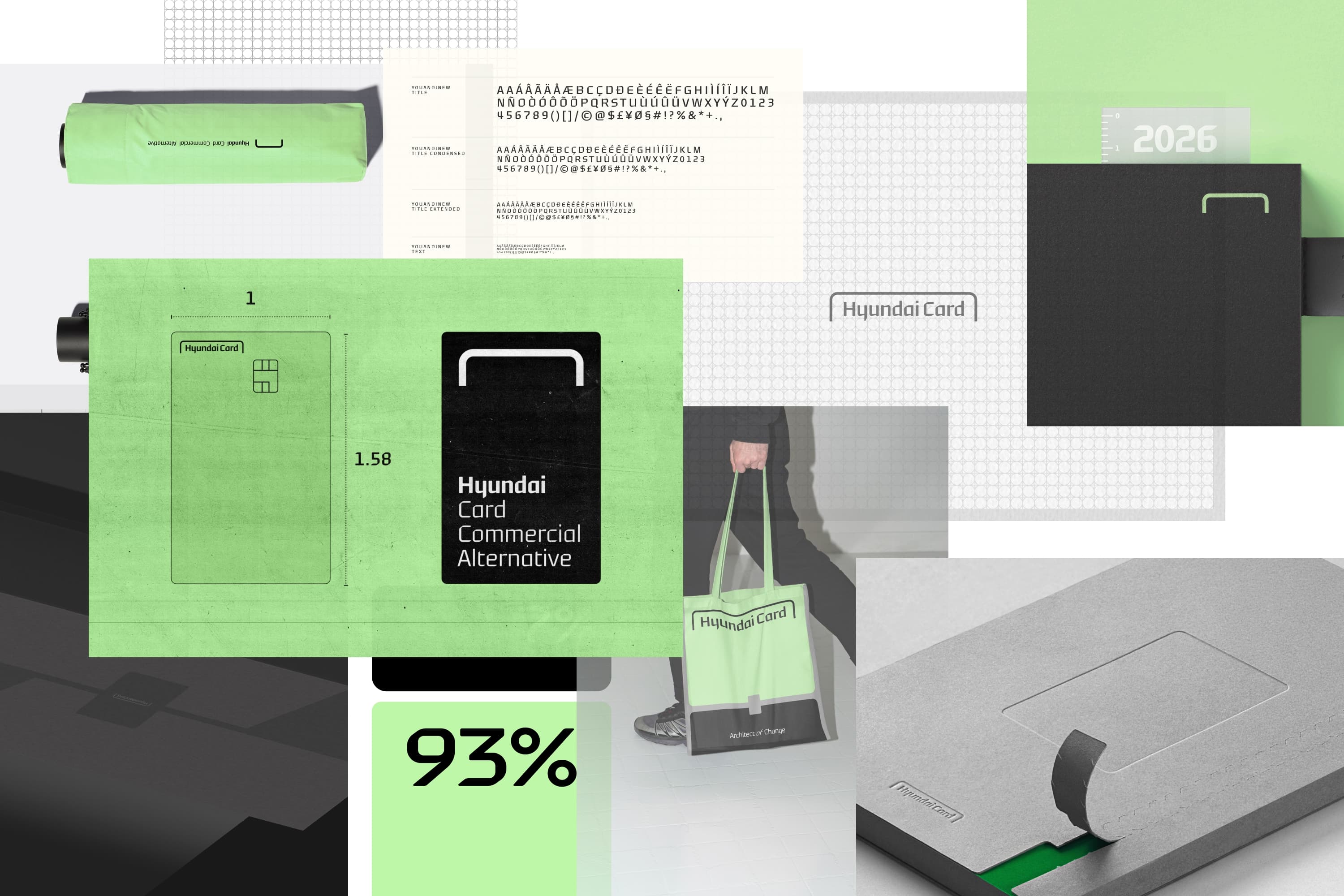
We replaced it with a system: a fixed core of details that never move, from how the logo sits to which typeface carries it, and flexible elements that give each card its own world. The entry cards, M, X and Z, are built around repeat rewards and use a generative system of bright colour and repetition. Modular packaging holds the whole range together, each card sealed in a protective layer that peels back to reveal its character.
What changed
We wrote “Architect of Change” as an internal design ethos and presented it to Ted Chung in his office in Seoul, expecting it to stay there. He took it out of the deck and put it on the outside of the company. It now appears on card packaging and has become the language the business uses to explain itself.
Among Korea’s major card issuers, Hyundai Card was the only one to record earnings growth in 2025.
Hyundai Card asked for a design ethos. It now has a reason for everything it creates to belong to the same company.
Industry
Financial Services
What We Did
Brand Strategy, Brand Architecture, Visual Identity, Research